

Ursa Health Blog
Visit Ursa Health's blog to gain healthcare data analytics insights or to get to know us a little better. Read more ...
Categories
Healthcare organizations increasingly rely on algorithms to guide decisions regarding patient care. If bias exists in the algorithms, organizations run the risk of treating patients unfairly. Although evidence of such bias has been documented, the good news is that steps can be taken to reduce bias.
The general concern is whether an algorithm unfairly disadvantages groups within protected attributes, such as race, color, religion, gender, disability, or family status1. To date, most work has focused on forming tests for unfairness by developing criteria that can be applied to an algorithm’s inputs and outputs. Most of these criteria are observational, meaning that they rely solely on the observed relationships between risk scores, features, outcomes, and protected attributes.
However, observational criteria are limited, so they must be augmented with implicit assumptions about the underlying causal process. Observational analysis describes what has occurred, while causal analysis goes further by addressing the question of why.
Accordingly, observational analysis will return good predictions so long as future conditions resemble those from the past. Causal analysis is stronger because it gives predictions under changing conditions, such as through the introduction of external interventions. There is no free lunch, however, so this greater power comes at the cost of additional assumptions about the underlying causal relationships.
Modern methods now allow for the explicit and precise specification of causal assumptions, which several researchers argue has great utility in answering questions of fairness. When theoretical commitments are made transparent, for example, they are exposed to criticism and refinement. In the process, researchers can uncover new areas of investigation that may lead to a deeper understanding of the causal relationships that underpin the observed data.
This blog uses a simple example to demonstrate the limits of observational criteria, as well as the benefits of considering underlying causal relationships. It specifically evaluates the label choice criterion because of its recent prominence in healthcare, although the conclusions also apply to observational criteria more generally. With respect to population health, the label choice criterion asserts that if there is no bias, then groups of patients who are assigned similar risk scores should also have similar health status. At face value, this appears eminently reasonable.
However, the example will show that mechanistic application of the label choice criterion, without consideration of underlying causal relationships, can lead to serious errors that actually compound inequity.
Risk score example
We can illustrate the essential role of causal inference for questions of fairness with a simple example. The details underlying this example can be found here.
Scenario 1: Total cost outcome
SaddlePoint HealthCorp wants to develop a risk score to target its high-need patients for additional care. The organization decides that year-ahead total patient cost estimates are a good proxy for patient need and selects total cost for its targeted outcome (or “label”). Two potential predictors are also available:
- The first is an illness composite score that is constructed from a patient’s age, lab values, and chronic conditions. The higher the patient’s score, the worse his or her health.
- The second is a patient’s self-identified race. For this example, we use the two fictitious races of Noffians and Fasites.
SaddlePoint assigns Ursa Health the job of constructing the risk score. After assembling the data, we begin by inspecting basic summary statistics:
Total cost outcome summary statistics (per person)
| race | avg_IllnessScore | avg_TotalCost |
| Fasites | 100.0 | $10,475 |
| Noffians | 109.9 | $9,504 |
Despite displaying a higher average illness burden, the Noffians have lower healthcare utilization: around $1,000 less per person in average year-ahead costs. This result is immediately concerning since we expect worse health to lead to higher utilization. However, we proceed to train a regression model that uses both the illness score and race as predictors. Each patient’s risk score, then, is only his or her predicted year-ahead total cost.
In light of the suspicious aggregate statistics, we evaluate the risk score using the label choice criterion. The plot below shows the criterion by comparing illness levels for patients with the same risk score percentile rankings. We find that Noffians have higher average illness scores at all levels of predicted risk, suggesting the presence of algorithmic bias.
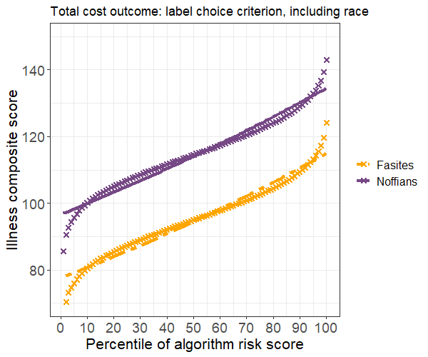
One common strategy to rectify bias is to exclude race from the set of predictors. We implement this strategy by fitting a model with the illness score as the only predictor, then reevaluate the results. Average illness scores are now equal for Noffians and Fasites with similar risk scores, so our strategy has successfully resolved the label choice bias.
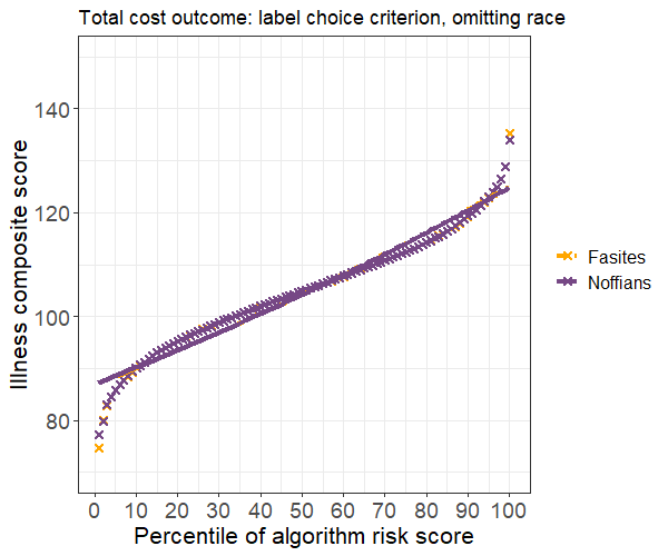
However, we also observe a large decrease in accuracy, with the bias-free model accounting for only 39 percent as much of the variance as the first model. We ultimately decide this trade-off is acceptable, so we recommend implementing the model that excludes race.
Scenario 2: Avoidable costs
A member of our team suggests that year-ahead total patient cost is a poor proxy for healthcare need. A better alternative is avoidable costs, such as those due to unplanned emergency department (ED) visits and admissions. After constructing the new outcome measure, we again begin by inspecting the summary statistics:
Avoidable costs outcome summary statistics (per person)
| race | avg_IllnessScore | avg_AvoidCost |
| Fasites | 100.0 | $5,000 |
| Noffians | 109.9 | $5,996 |
The change in the outcome definition has a stark effect: Noffians now average about $1,000 more per person in avoidable costs. This difference makes more intuitive sense because Noffians have higher average illness scores. We proceed to fit a model with the illness score and race as predictors and, maintaining our due diligence, again test for algorithmic bias. Surprisingly, the risk score now appears to disadvantage Fasites.
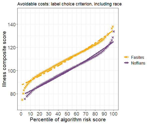
The disparity in average illness scores is smaller than before but clearly present. We could again attempt to resolve the bias by removing race from the model. But would such a move be prudent?
Exploring fairness with causal graphs
One approach to make sense of these results is to think through what might cause them. Causal graphs are an intuitive way to organize your assumptions about the data-generating process. A causal graph includes vertices that represent variables, directed edges that represent causation, and a set of assumptions that allows you to identify causal effects.
Such graphs can be used to create scenarios that, while stylized, still describe plausible bias mechanisms that may be operating within healthcare systems. One good example of their representational power is found in their application to questions about racial disparities in COVID mortality.
Let’s revisit the two label-choice scenarios to see how causal inference might shed light on the findings. As a first step, we need to assess the population characteristics of Noffians to see how they contrast with Fasites. Suppose that Noffians have higher poverty rates and tend to live in neighborhoods with more pollution and worse access to transportation and other basic services. Now, we’ll try to use these facts to construct a plausible story that explains our findings.
Causal graphs for total cost outcome
Let’s assemble our hypotheses for total cost outcome. The first disparity that needs explanation is the observed difference in measured illness between Noffians and Fasites. Noffians’ higher exposure to poverty and pollution, known causes of adverse health outcomes, could explain the difference.
Next, we need to explain why Noffians’ worse health does not result in higher healthcare costs. One potential explanation is that the Noffians’ more precarious economic state likely creates barriers to accessing healthcare. Unstable housing and lack of transportation, for instance, make it more difficult to secure healthcare services. Noffians might also receive differential treatment because of their lower socioeconomic status or due to direct racial discrimination.
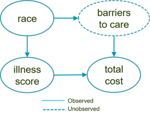
Our collection of hypotheses can be represented with this simple causal graph:
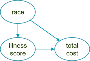
The arrow from race to illness captures the negative causal effect on Noffian health due to socioeconomic factors while the arrow from race to total cost describes how barriers to access depress healthcare utilization. Finally, the arrow from illness score to total cost reflects a general assumption that utilization increases as health worsens.
This graph explains why accuracy would decrease if race were removed from the model. Here, race depresses costs, so we would lose the variability that it explains. In addition, the graph shows that race is a confounding variable, which implies that our estimate for the effect of illness would be biased if race were omitted from the model.
A causal graph is a convenient shorthand that will usually benefit from further elaboration. To study the causal effects of race, it is useful to conceive of it as a composite measure that we can break apart into constituent elements, such as class, norms, and skin color. These elements, in turn, might suggest proxy measures that better lend themselves to intervention.
For instance, we could elaborate upon the previous causal graph by adding a currently unobserved variable that mediates the causal effect of race.
We could then further break down this abstract and unobserved “barriers to care” variable into increasingly specific concepts that we could conceivably measure more easily.
Causal graphs for avoidable costs outcome
Now, let’s assemble our hypotheses for the avoidable costs outcome scenario and create a causal graph. The explanation for Noffians’ worse health carries over from the previous scenario. Thus, the primary finding that needs explanation is how the label bias criterion could have flipped: Why is it that Fasites now have a higher illness burden, conditional on risk score, than Noffians?
Recall that avoidable costs are attributable to acute care utilization such as ED visits and admissions. Patients are believed to be in greater control of acute care utilization, which should make it less susceptible to the influence of healthcare barriers. At the same time, those barriers may hinder the treatments intended to prevent or slow the progression of chronic conditions. For example, Noffians may find it more difficult to consistently procure and use vital medications, which in turn would make them more likely to experience urgent health events that require immediate care.
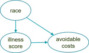
This set of causal hypotheses is depicted below. The only difference is that race now causes an increase in avoidable costs for Noffians, whereas in the first scenario it caused a decrease in their total cost.
Again, the utility of the causal graphical approach is realized through iterative elaboration as we steadily refine our assumptions. For this example, we might propose the more detailed model below. This graph introduces the unobserved intermediary cause of managed illness, which is a function of a patient’s initial illness and race.
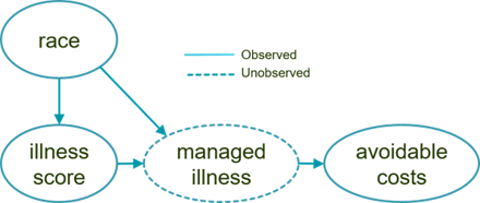
We assume that Fasites receive better care management, for example, and so the causal influence of race is to reduce their managed illness burden relative to Noffians.
Causal graph conclusions
Review of the causal graphs provides a possible explanation for why violation of the label choice criterion is problematic for the total cost outcome but not for the avoidable costs outcome. In the former case, barriers to access are driving the total cost for Noffians lower than what would be expected if utilization depended only on health need. In the latter case, inadequate care is causing the illness progression for Noffians to worsen, which then requires urgent treatment.
If this explanation is correct, then managed illness would be what is known as a resolving variable. In other words, attempting to eliminate bias for avoidable costs would actually compound inequity since it would deny Noffians the additional treatments that they need.
Causal models as a path toward greater understanding
Causal considerations are central to evaluations of algorithmic bias. Observational criteria alone, such as the label choice criterion, are not enough to determine whether an algorithm is fair. You must also uncover why the disparity exists, which is fundamentally a causal question.
Causal models are a rich source from which to generate new hypotheses and directions for additional investigation. In the above examples, we might measure barriers to healthcare access using data on transportation availability, housing stability, and so on. And we could measure care management using data on primary care visits, medication adherence, and rates of medically appropriate screenings. Additional measures may then, in turn, allow us to test and further refine our causal models.
More importantly, they can provide higher resolution when we seek to determine what specifically is driving patient needs, which will ultimately allow for more precise interventions and better care.
1 While some researchers distinguish between fairness and algorithmic bias, we can elide that distinction for the purposes of this post and use those terms interchangeably.