

Ursa Health Blog
Visit Ursa Health's blog to gain healthcare data analytics insights or to get to know us a little better. Read more ...
Categories
The run chart is a classic tool of quality improvement work. Depicted as a line graph, it provides insight into changes in a specific performance measure over time. The chart's x axis presents chronological time intervals, while the y axis presents counts or rates of the data being measured.
Visually, run charts resemble time series charts, or the type of charts commonly used to present data about stock prices, for example. However, run charts are concerned with data related to the execution and outcomes of processes. These charts provide a pulse check of performance at set intervals to reveal the consistency of an improvement effort’s results.
Here, we’ll take a look at an example of the run chart’s utility in healthcare, then share a bit about how Ursa Studio uses these charts.
Keeping tabs on CB rates
Since 1990, the cesarean birth (CB) rate has tripled due to an increase in elective cesarean deliveries, and the expectation is that this upward trend will continue. Some hospitals have CB rates over 50%.
However, cesarean deliveries are significantly more expensive than maternal deliveries. In addition, cesarean deliveries do not drive better outcomes above a certain utilization rate. The Joint Commission has reported that “hospitals with CB rates at 15-20% have infant outcomes that are just as good and better maternal outcomes.”
Therefore, hospitals should closely monitor CB rates and understand what causes them to fluctuate as a prelude to implementing any performance improvement initiatives.
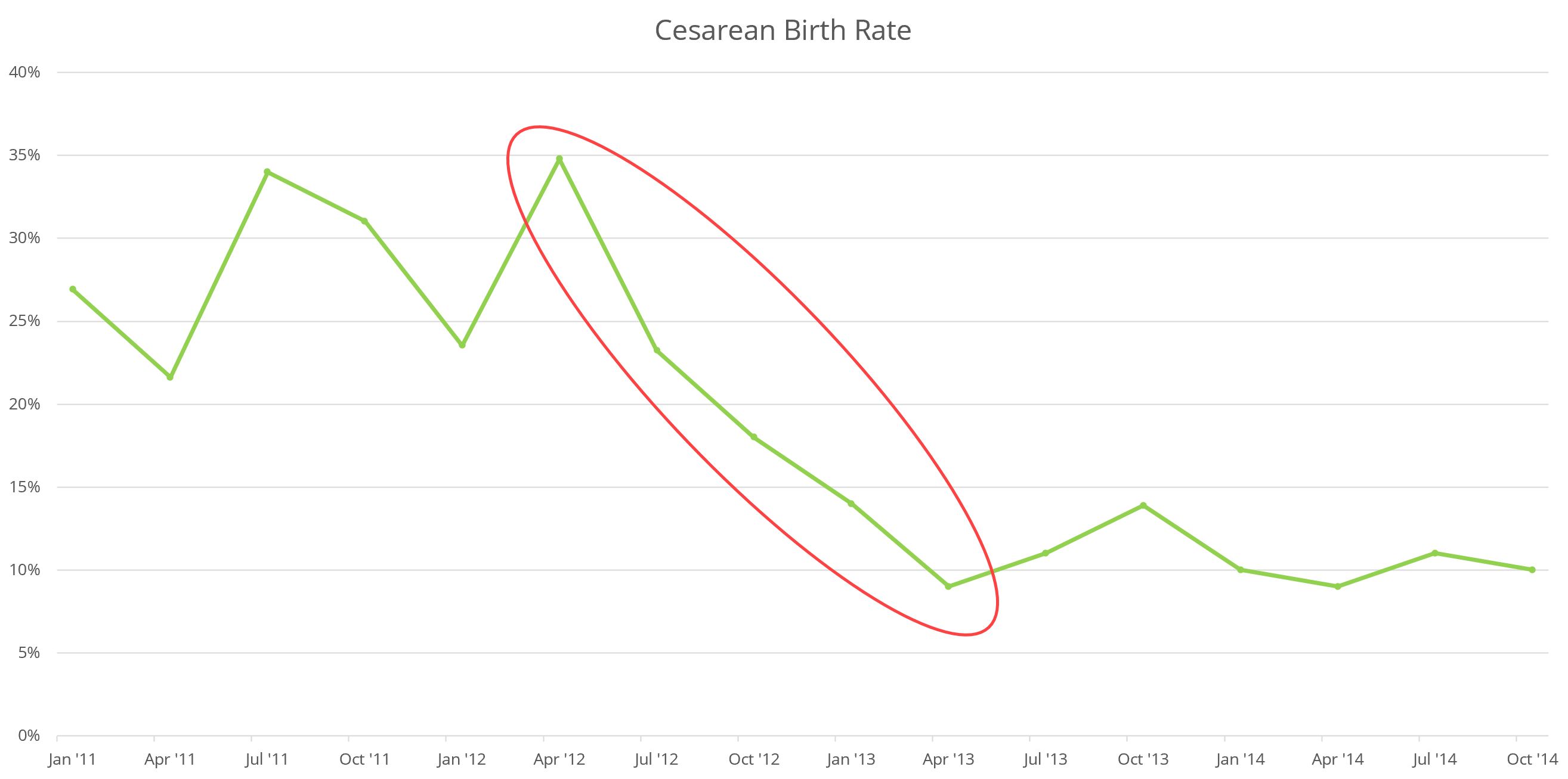
Several approaches can be used with run charts to elicit information for improvement efforts, but here we will focus on two: trends and astronomical data points.
Trends
In quality improvement work, a trend is five or more consecutive data points moving in the same direction. The run chart below presents CB rates over a four-year period at an example hospital, showing a statistically significant pattern related to the decline in CB rates over time. Here, the trend points to a desirable outcome: a steady decline in the hospital’s CB rate. The trend is followed by a period of stable CB rates, which means the rate decline was likely driven by a quality improvement intervention, a change in the hospital’s policies, or another such purposeful effort.
Astronomical data points
The second approach for eliciting information related to improvement efforts is to be aware of any astronomical data points: steep variations from other plotted points in a graph. Unlike trends, which have a statistical backing, observation of an astronomical point is a subjective matter. These data points may be due to events of impact or data anomalies. See the following chart for an example run chart with an astronomical data point.
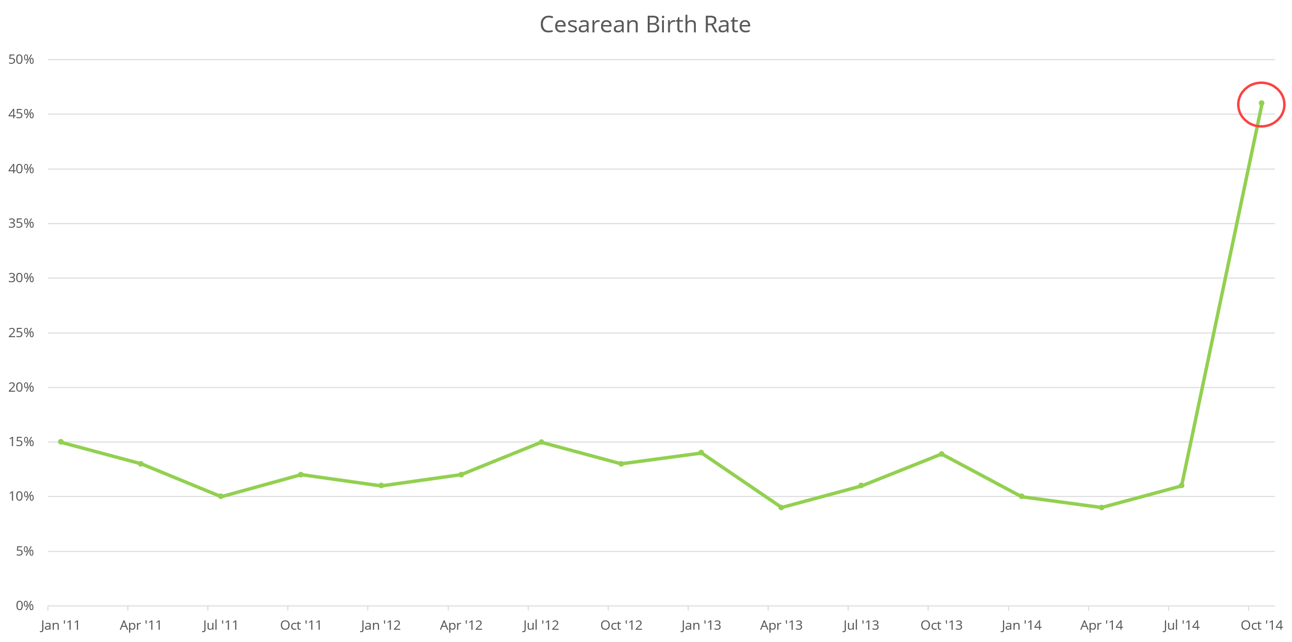
There is an obvious anomaly here. The CB rate stayed in a 10% to 15% range preceding the October 2014 result. So, what happened? This is the question that an astronomical point calls us to ask. Understanding what caused the spike is the first step in taking corrective action to restore the previously desirable rate.
Ursa’s approach
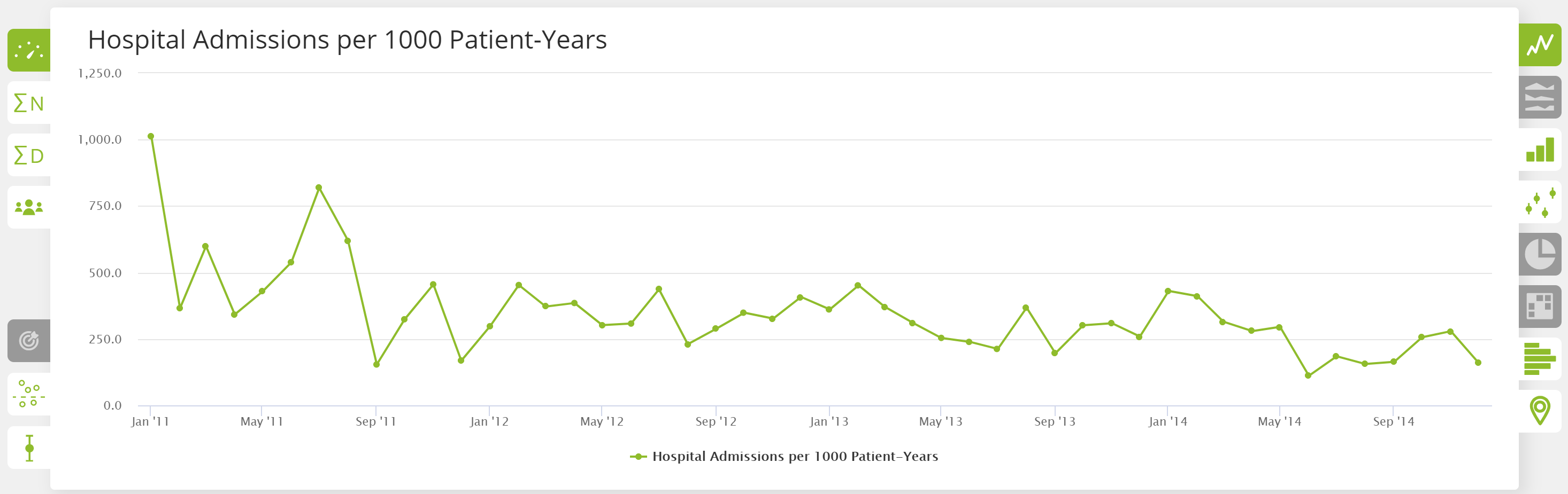
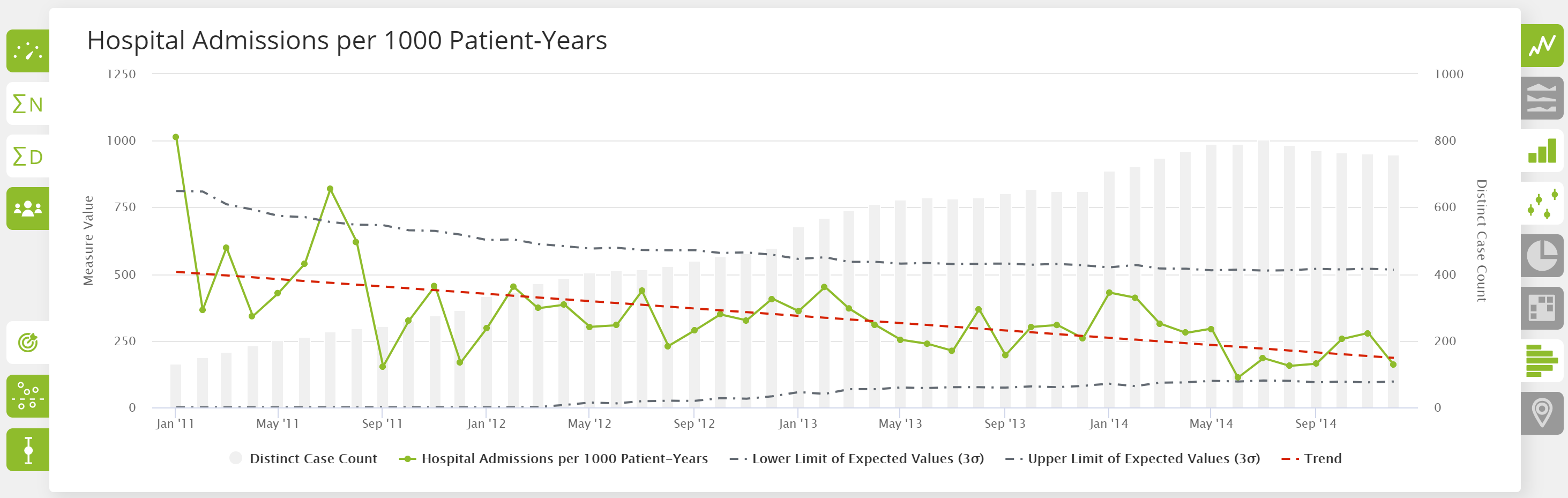
In Ursa Studio, Ursa Health’s analytics development platform, measure results can be presented through a variety of chart types, but the default visualization of a measure’s result is the run chart. This enables users to first see the measure’s performance over time, the critical component necessary to determine whether improvement efforts are on or off track.
The screenshot below illustrates a run chart in Ursa Studio, which is rich with options for rapidly interpreting measures. With a couple mouse clicks, users can add control limits and the count of distinct patients associated with each period’s results, further enhancing the value of the analysis.
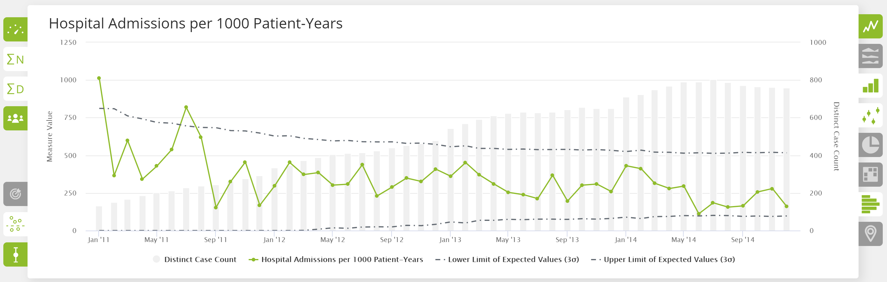
With another mouse click, you can chart a regression line to see the overall direction in which the measure’s results are moving. This helps to easily answer the question, “Is the measure moving toward or away from the desired performance target?”
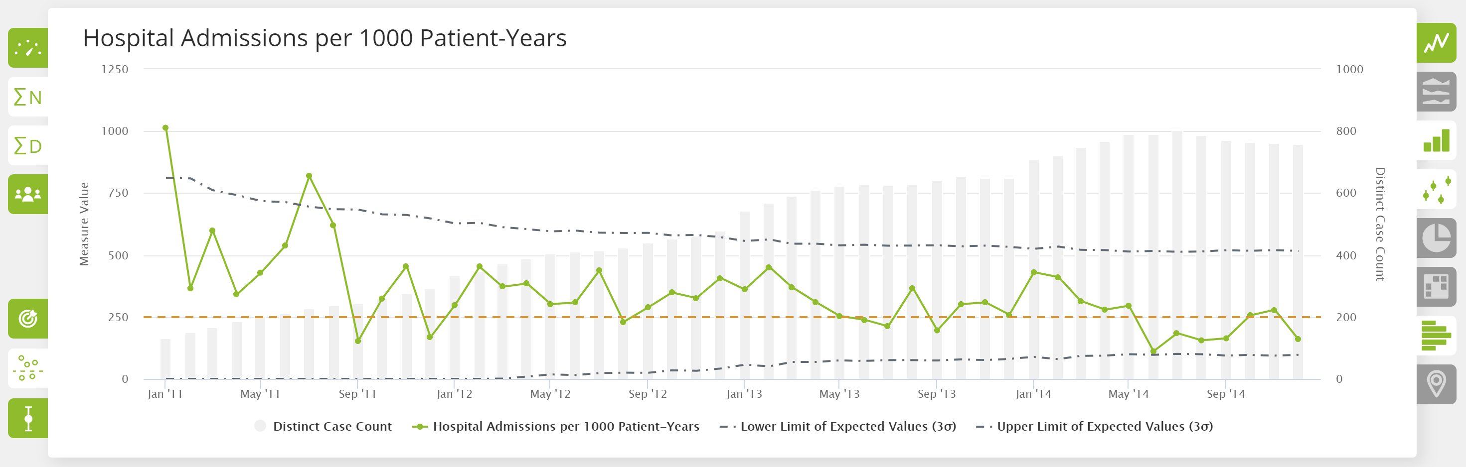
Ursa Studio also enables you to set specific targets for measures, then toggle the target on and off with a mouse click. You can see quickly and clearly how a measure’s performance compares to its target.
To really understand how well a measure is performing, you need to see its results over time. Once that information is charted, you want to review the measure results for astronomical points or trends to better interpret and respond to the real-life scenario that is being measured.
Run charts in Ursa Studio enable you to do that and more. You can add patient counts, control bars, regression lines and measure targets with a few mouse clicks. In just a few moments, you can ascertain a wealth of information about a measure, which empowers more responsive improvement efforts.
To learn more about Ursa Studio, drop us a line at info@ursahealth.com.